How to Extract Data From Charts and Graphs
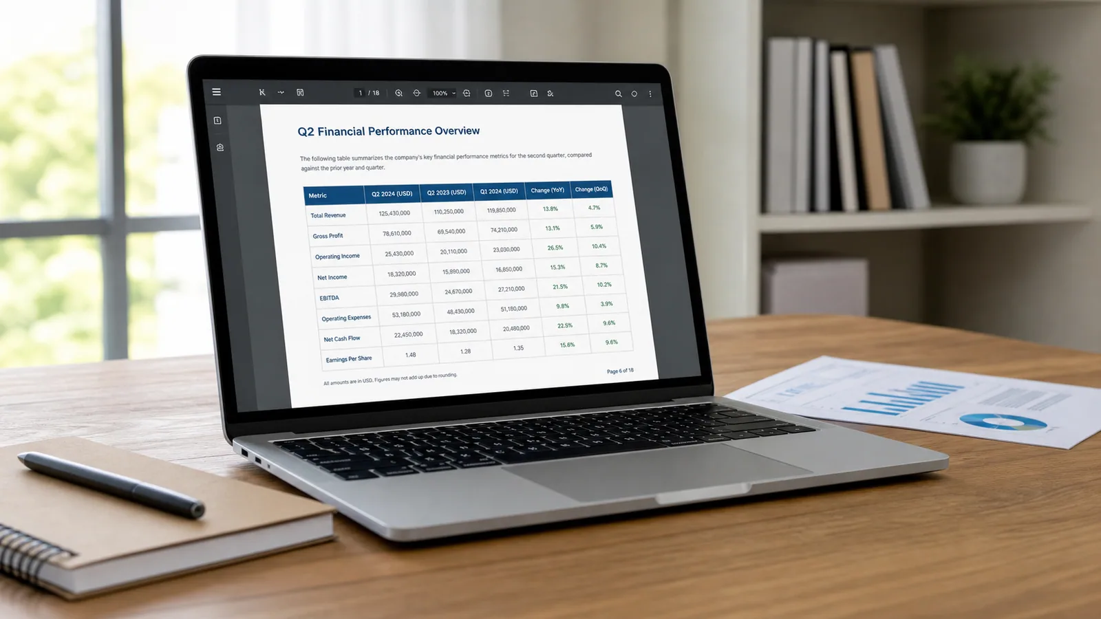
A chart can show exactly the numbers you need while keeping the table behind it out of reach. Maybe it is inside a PDF, screenshot, research paper, report, dashboard, or old presentation. You can see the trend, but you cannot sort the values, run calculations, or add them to a spreadsheet.
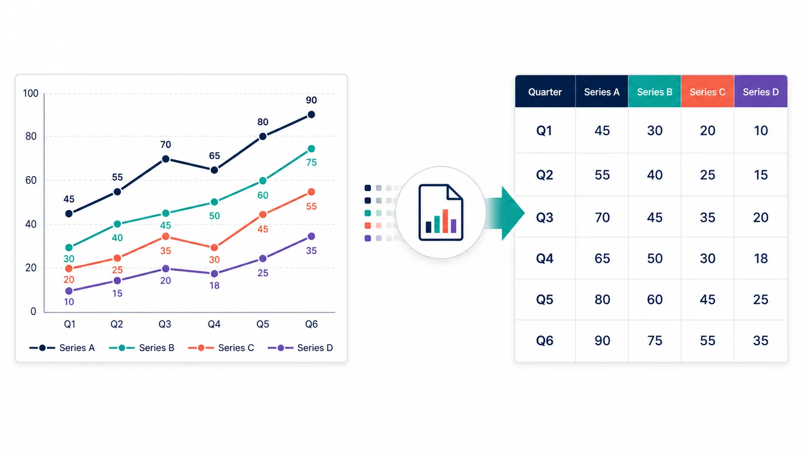
If every value is printed clearly, you can copy it manually. The problem is that many charts encode numbers through the height of a bar or the position of a line or dot. Graph-reading software helps convert those visual positions back into numbers.
That can save a meaningful amount of work. A study comparing manual estimation with software-assisted extraction found that software reduced extraction time by 47%. The values still need to be checked, but you no longer have to estimate every point from scratch.
This guide shows the simplest methods for turning bar charts, line graphs, scatter plots, and similar images into clean CSV or Excel data.
The short answer
The best extraction method depends on the chart:
| Situation | Best starting method | Typical output |
|---|---|---|
| The chart has a visible download or source link | Download the original data | Exact CSV, XLSX, or JSON |
| You want a quick table from a clear chart image | Extractify | Editable rows and columns |
| A line or scatter chart has many dots or a curve without printed values | WebPlotDigitizer | Measured X and Y values |
| You want another online graph-reading tool with several export formats | PlotDigitizer | CSV, Excel, JSON, or other formats |
| You want free software that runs locally on your computer | Engauge Digitizer | Digitized points and CSV |
| The chart is simple and only a few values matter | AI-assisted or manual extraction | Small hand-built table |
Whenever possible, retrieve the original dataset first. Data extracted from an image is an estimate reconstructed from pixels, labels, and axis geometry. It should not be treated as more precise than the chart itself.
What does it mean to extract data from a chart?
Chart extraction reverses the usual visualization process.
A chart normally starts with a table. Software maps each value to a position, bar height, point, color, angle, or area. When only the finished image remains, an extraction tool has to work backward from those visual marks to approximate the original numbers.
The final table may contain:
- category labels and bar values;
- dates and values from a time-series line;
- X and Y coordinates from a scatter plot;
- several named data series;
- error-bar limits;
- units, axis scales, and source information.
This differs from ordinary OCR. Optical character recognition can read the title, legend, and tick labels, but the important value may be represented only by the height of a bar or the position of a point. Reliable extraction therefore combines text recognition with chart structure and coordinate calibration.
Method 1: Look for the original data
Spend a few seconds checking for a Download data, CSV, Excel, Export, source, or supplementary-file link. If the original table exists, use it: it will be more accurate than rebuilding values from an image.
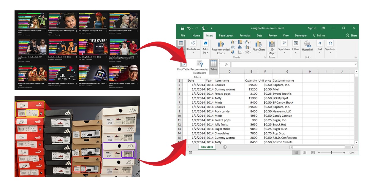
If it does not, save the highest-resolution chart available. Prefer the original PDF page or image over a compressed thumbnail. For dashboards, the guide to extracting structured data from screenshots explains how to capture a clean source image.
Method 2: Extract a chart into a table with Extractify
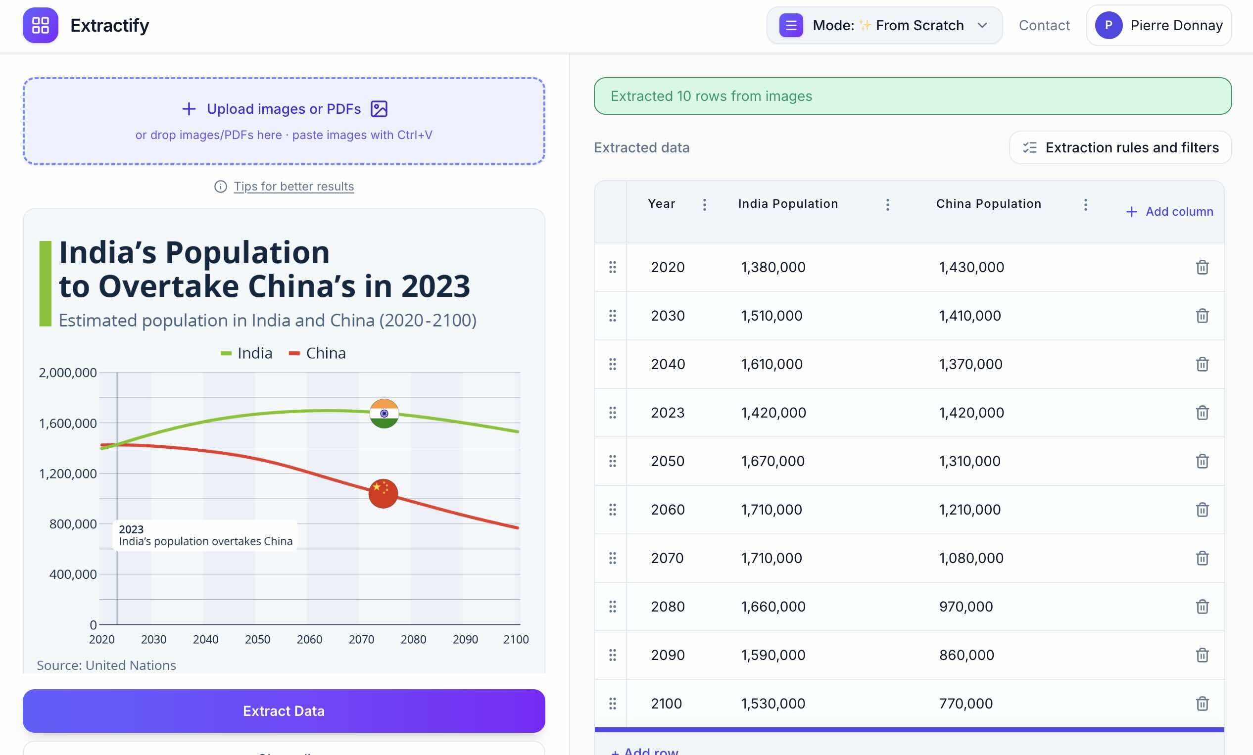
Extractify's custom extraction workflow is a practical option when the chart is visually clear and you want editable rows and columns without manually calibrating every axis.
The website already supports a Charts to Data workflow for pulling values from charts and graphs into structured data. It is most useful when labels, legends, and data marks are readable and the desired table structure can be described clearly.
Price: A free Extractify account includes up to 300 extractions per month.
How to use it
- Save the chart as a PNG or JPG, take a clean screenshot, or use the relevant PDF page.
- Open Extractify's custom extraction mode.
- Upload the chart image.
- Let Extractify define the columns automatically based on the chart.
- Run the extraction.
- Compare the editable table with the chart.
- Correct uncertain values and export the result to CSV or Excel.
When this method works best
- The chart has readable labels and tick marks.
- You want the result organized as a table immediately.
- Several chart images need the same output columns.
- You want to review and edit the table before export.
- Approximate chart values are sufficient for the intended analysis.
Limitations
Closely overlapping lines, tiny points, low contrast, decorative 3D effects, truncated axes, and dense legends can create ambiguity. Logarithmic scales also need special attention because equal pixel distances do not represent equal numerical increments.
For scientific measurement or a graph with many points, a graph-reading tool that measures values against the axes is usually the stronger choice.
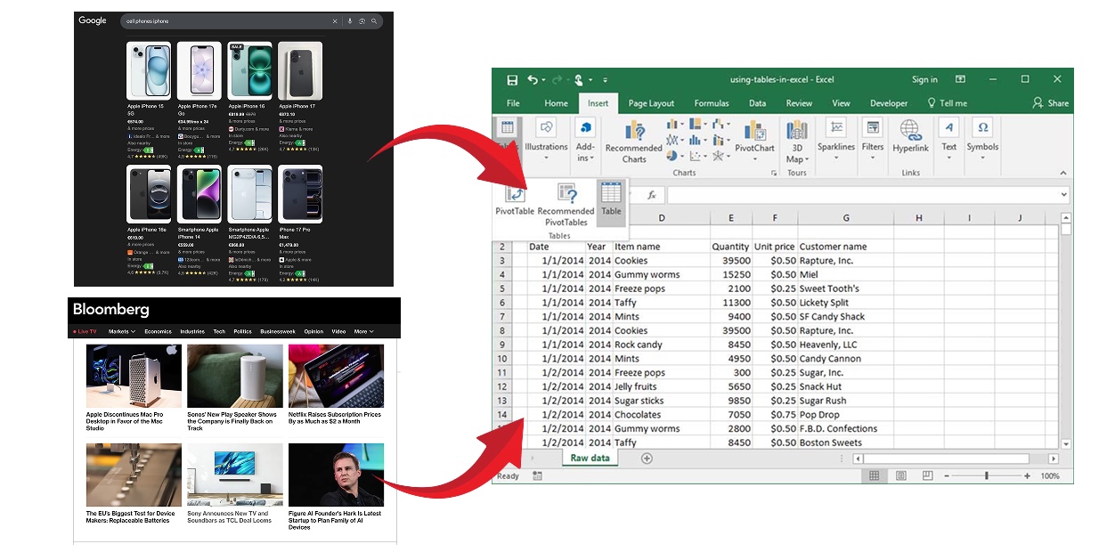
For related image workflows, see the broader guide to extracting data from images into Excel.
Method 3: Digitize precise coordinates with WebPlotDigitizer
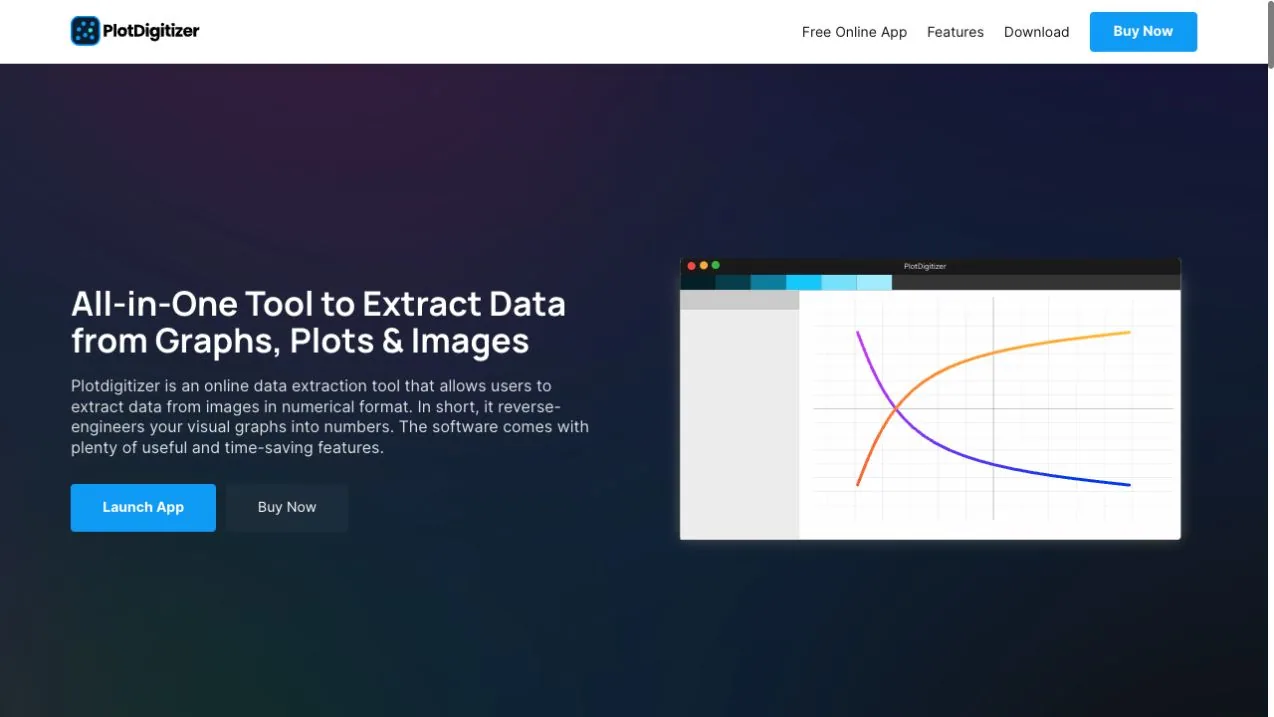
WebPlotDigitizer is designed specifically to recover data from chart images. It supports manual point selection and automatic extraction for several plot types.
Price: WebPlotDigitizer is free and open source.
The basic workflow is:
- Load an image or PDF.
- Select the axis type, such as 2D X-Y, bar, polar, ternary, or map.
- Calibrate the axes using known points and their displayed values.
- Select points manually or configure automatic extraction.
- Export the digitized values as CSV or copy them into another tool.
Why axis calibration matters
Suppose a chart's vertical axis runs from 0 to 500. The software needs at least two known positions on that axis to convert screen pixels into numerical values. For a normal linear scale, the conversion is proportional. For a logarithmic or date axis, the mapping is different.
WebPlotDigitizer recommends placing calibration points far apart and supports fine adjustments for better accuracy. Its automatic extraction can also isolate a colored curve within a defined region of interest.
When this method works best
- Line graphs and scatter plots with many points
- Scientific figures where coordinates matter
- Charts with linear, logarithmic, or date axes
- Curves that can be separated by color
- Projects that need a repeatable calibration process
Limitations
Calibration adds setup time, and automatic tracing still needs inspection. Grid lines, annotations, compression artifacts, overlapping series, and curves with similar colors can be mistaken for data.
Method 4: Use PlotDigitizer for another guided option
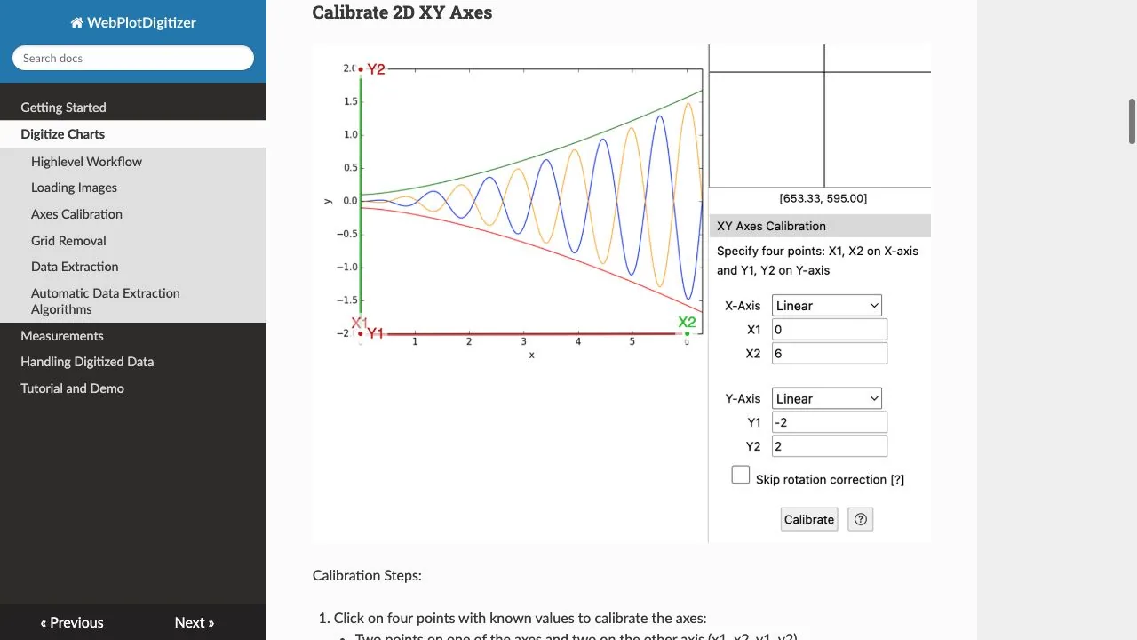
PlotDigitizer provides a guided online and desktop workflow for extracting points from graph images.
It supports common image formats and several graph types, including X-Y, horizontal bar, vertical bar, pie or doughnut, polar, and ternary plots. Extracted datasets can be exported to formats including CSV, Microsoft Excel, JSON, TSV, and Python lists.
Price: The online version is free. PlotDigitizer currently lists its Pro desktop license at a promotional one-time price of $40, normally $80.
The process is similar to other calibrated digitizers:
- Upload the graph.
- Choose the graph type.
- Calibrate its scale.
- Create and name a dataset.
- Select or detect the required points.
- Export the values.
PlotDigitizer is useful when you want multiple export formats or prefer its guided interface. Some functions are limited to PlotDigitizer Pro, so check the free online version before starting a large project.
Limitations
The tool does not remove the need to understand the axes. A technically successful extraction can still be wrong if a logarithmic scale is treated as linear, two series are mixed together, or the chart begins at a non-zero baseline.
Method 5: Use Engauge Digitizer for an open-source desktop option
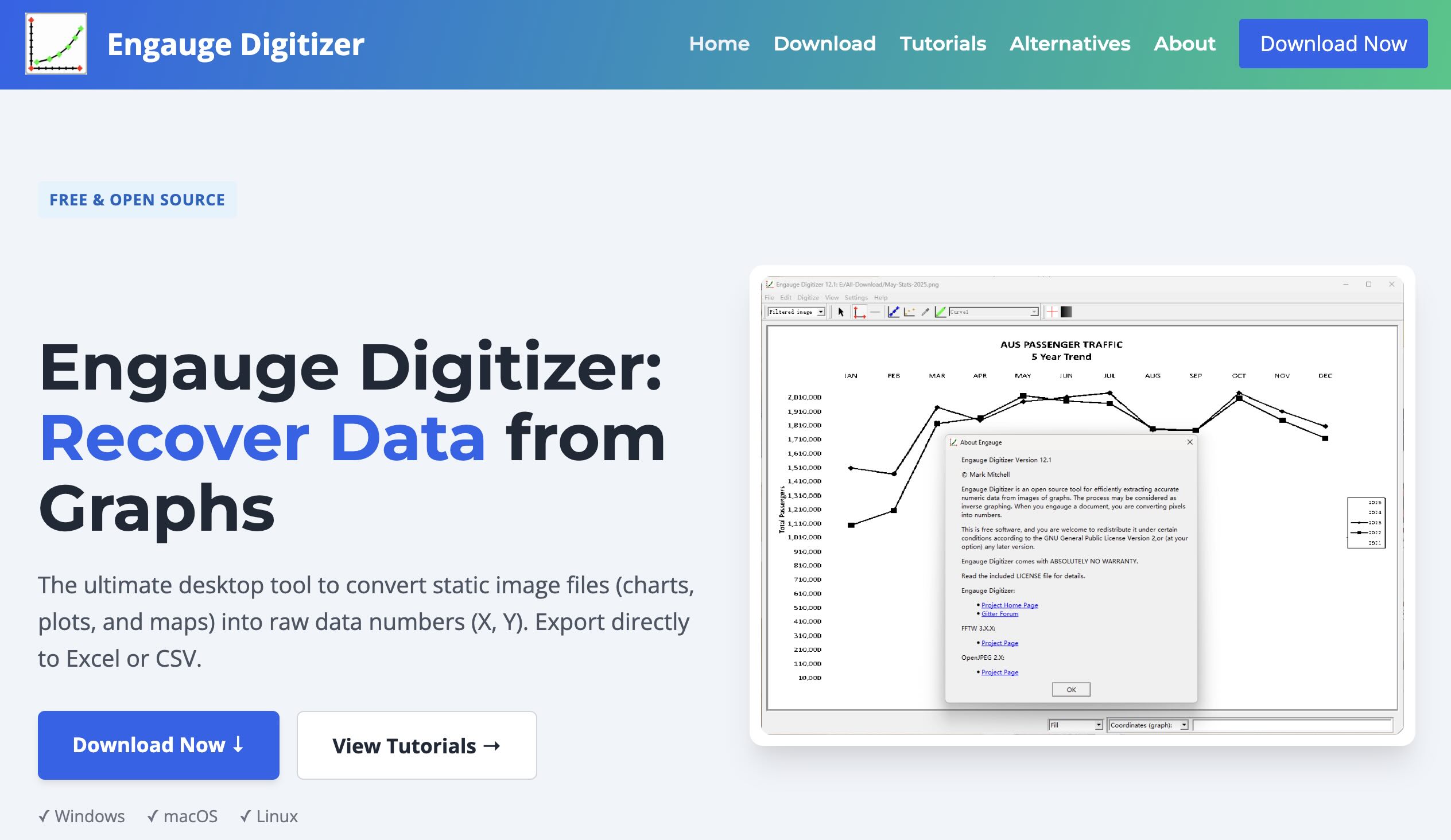
Engauge Digitizer is an open-source desktop application that imports graph images and recovers data points by calibrating axes and tracing curves or points.
Price: Engauge Digitizer is free, open-source software.
It can be a good fit when:
- the chart data should stay on your computer;
- you want an open-source workflow;
- you need to digitize several similar plots;
- you prefer a desktop interface over uploading images to a web service.
The basic process is to import the image, mark reference points on the axes, digitize the curve or points, inspect the recovered coordinates, and export them to CSV.
Limitations
Engauge has a more technical interface than a one-click extraction tool. It is best suited to users who are comfortable checking calibration and correcting detected points manually.
Method 6: Use an AI assistant for a small one-off chart
An AI assistant with image input can be convenient when you need a few visible values or a quick first-pass table.
Upload the clearest version of the chart and ask for a precise schema:
Convert this chart into a table with columns for series, category, value, and unit. Preserve the legend names. Mark any uncertain value instead of guessing silently.
Tools such as ChatGPT can create tables from supplied information, while its data-analysis features can work with uploaded structured files. For chart images, treat the returned numbers as estimates and verify them against the axes.
Price: ChatGPT has a free tier with limited file and image uploads. Paid individual plans currently start with Go at $8 per month and Plus at $20 per month.
This method works best for:
- simple bar charts with printed values;
- charts with a small number of points;
- extracting labels, legends, and obvious totals;
- creating an initial table that will be checked manually.
It is less suitable for dense scatter plots, overlapping lines, small error bars, log scales, or measurements where small numerical differences matter.
Do not upload confidential charts, unpublished research, personal information, or commercially sensitive reports without checking the service's data-handling terms.
How to extract different chart types
Bar charts
Create one row per bar. Record the category, series, value, unit, and whether the value was printed or estimated from the axis.
Watch for:
- axes that do not start at zero;
- grouped and stacked bars;
- negative values;
- error bars;
- 3D perspective;
- totals that combine segments.
For stacked bars, extract each segment separately rather than recording only the total height.
Line graphs
Create one row per X position and series. When the chart shows a continuous curve rather than explicit markers, decide on a consistent sampling interval before extraction.
Watch for:
- overlapping series;
- smoothed curves;
- missing points;
- irregular dates;
- secondary Y axes;
- logarithmic scales.
Scatter plots
Create one row per point with X, Y, series, and any visible label. A calibrated digitizer is normally better than general OCR because most values are encoded entirely by position.
Watch for overplotting: several observations may occupy the same visible location.
Pie and doughnut charts
Use printed percentages or labels when available. Estimating values from slice angles is usually less reliable than extracting bar heights or point coordinates.
Confirm whether percentages have been rounded and whether the visible slices add to 100%.
Heatmaps
The color legend is part of the scale. Record row and column labels, then map each cell color to the closest legend value or interval.
Heatmaps with gradients, transparency, or compressed colors can be difficult to reconstruct accurately from screenshots.
Common mistakes to avoid
- Extracting from a thumbnail when a PDF or larger image is available
- Treating a logarithmic axis as linear
- Ignoring a secondary Y axis
- Mixing two similarly colored series
- Reading a stacked segment as the cumulative total
- Assuming the chart begins at zero
- Reporting more precision than the graphic supports
- Trusting OCR to infer point coordinates
- Omitting units or category labels from the exported table
- Using extracted values without citing the original chart
Frequently asked questions
Can you convert a graph image to Excel?
Yes. Use an AI extraction tool for a straightforward chart-to-table conversion or a graph-reading tool when many individual points must be measured accurately. Export the result as CSV or XLSX, then review it in Excel.
What is the best free tool for extracting data from a graph?
WebPlotDigitizer is a strong starting point for calibrated line, scatter, and bar-chart extraction. Engauge Digitizer is useful when you prefer open-source desktop software.
Can OCR extract values from a chart?
OCR can read titles, legends, axis labels, tick values, and printed data labels. It cannot reliably recover values encoded only by position, height, angle, or color without additional chart interpretation or calibration.
How accurate is chart digitization?
Accuracy depends on image resolution, calibration, chart type, line thickness, axis scale, and visual overlap. A clean high-resolution plot with visible markers can be reconstructed closely; a compressed chart with several overlapping series may support only approximate values.
Is it acceptable to use data extracted from a published chart?
That depends on the intended use, licensing, attribution requirements, and applicable rules. Cite the original source, distinguish reconstructed values from source data, and seek permission or specialist advice when necessary. For research, preserve enough detail for another person to repeat the extraction.
Conclusion
Start with the original dataset whenever it is available. When only the chart remains, choose the least complicated method that can recover the precision you actually need: Extractify for a quick editable table, a calibrated digitizer for measured coordinates, or careful manual extraction for a handful of values.
Digitization can be dependable when the source image and calibration are handled carefully. A peer-reviewed evaluation reported more than 94% coder consistency for WebPlotDigitizer, but even strong tools cannot correct a cropped axis, an unreadable legend, or missing points. Keep the original chart beside the exported table, check several values manually, preserve the units, and report reconstructed values with appropriate precision.
If you want a quick first pass from a clear chart image, open Extractify's custom extraction workflow, describe the table you need, and review the result before using it in further analysis.